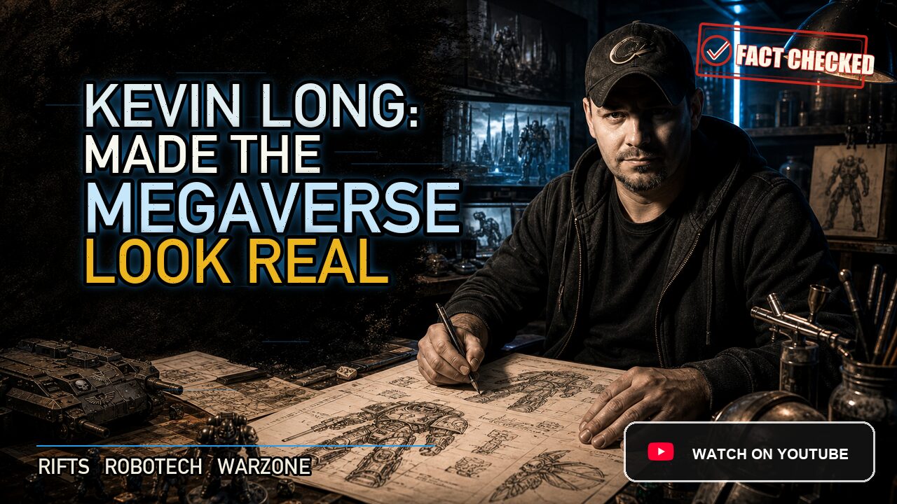
Kevin Long’s great trick was not that he could draw a robot.
Lots of artists can draw a robot.
Long could draw a robot that looked like it had been welded in a factory, deployed by a military, repaired by tired mechanics, and written into a rulebook by someone who expected players to ask exactly how the recoil worked.
That is why his Palladium Books work hit so hard.
Rifts could have been visual nonsense. On paper, it is a glorious collision: dragons, cyborgs, vampires, glittering power armor, skull-faced fascist armies, ley lines, alien invaders, demons, giant robots, and dimensional portals tearing Earth open. In the wrong hands, that much genre traffic becomes soup.
Long gave it structure.
His clean black line, chrome surfaces, heavy armor plates, tubing, skull motifs, rail guns, and mechanical silhouettes made the chaos readable. He did not make the Megaverse tame. He made it look engineered.
From Advertising To Armor Plate
Long came out of Michigan with a commercial artist’s discipline. He studied advertising illustration at the College for Creative Studies in Detroit, then worked in the Detroit advertising world before entering games.
That background matters.
Advertising art has to communicate fast. It has to make an object clear, desirable, and believable before the viewer looks away. Long brought that product-illustration clarity to tabletop science fiction. His machines did not float through the page as vague cool shapes. They had edges, joints, plates, guns, intakes, and apparent mass.
Around the mid-1980s, Erick Wujcik helped bring Long into Palladium’s orbit. Palladium was not TSR. It was smaller, stranger, scrappier, and willing to let its games sprawl across genre borders. That was exactly the kind of ecosystem where Long’s precision could become a house style.
He became one of Palladium’s defining artists from the mid-1980s through 1995.
Not just another illustrator in the credits.
The visual anchor.
Robotech Became Tabletop Hardware
Long’s Robotech work came first for many players.
The Robotech RPG had to do something delicate. It had to translate Japanese animation into American tabletop terms. The original anime already had brilliant mecha design, but a roleplaying book asks different things from a drawing than a cartoon does.
A player wants to know what the machine looks like when parked in a hangar. A Game Master wants to know where the weapons sit. A fan wants the fantasy, but the rules need the hardware.
Long’s Veritechs, Destroids, Cyclones, hover tanks, alien war machines, and military gear gave the Robotech books a physical seriousness. The mecha looked less like quick animation cels and more like equipment that could be assigned to a unit, damaged in combat, and repaired between missions.
That was his gift: he made the fantastic legible without draining the fun out of it.
For an American tabletop audience discovering anime mecha through game books, Long’s Robotech art was not secondary. It was the way the setting entered the imagination.
Rifts Needed A Translator
Then came Rifts.
Published in 1990, Rifts was Palladium’s wildest promise: a post-apocalyptic Earth where magic and technology returned together, where civilizations fought over ruins, and where anything from any dimension might step through a tear in reality.
Kevin Siembieda created and drove the game, but Long’s art gave it a body.
The Coalition States were not just described as a terrifying human-supremacist military power. Long made them look terrifying. The skull helmets, skull vehicles, black armor, angular hardware, Skelebots, SAMAS power armor, Enforcer robots, Sky Cycles, and Death’s Head-style transports made the faction instantly readable.
You did not need three paragraphs of lore to understand the vibe.
You saw the skulls and the machine discipline, and you knew.
The same was true of Rifts player archetypes. The Borg looked like a human life rebuilt into machinery. The Juicer carried speed, chemical doom, and violence in the same silhouette. The Crazy had the visual anxiety of metal nodes and brain-altering technology. The Ley Line Walker looked like someone surviving in a toxic world while touching forces older than cities.
Rifts was maximalist, but Long knew how to assign each idea a visual job.
The Glitter Boy Problem
The Glitter Boy may be Long’s most famous single Rifts image.
It is absurd in the best way: a chrome power armor suit carrying a rail gun so powerful that firing it creates a sonic boom. The suit is called glittering because its reflective armor is not just decorative. It is part of the machine’s protection and identity.
But the important part is not only the shine.
It is the recoil.
A lesser design would have stopped at "big gun, shiny armor." Long’s visual logic made the suit feel like it could survive its own weapon. The massive frame, heavy feet, reinforcement pylons, and battlefield stance all helped sell the rulebook idea that this thing needed stabilization or it would throw itself backward.
That is what separates Long from generic cool-machine art.
He drew the rule into the object.
Players could look at the Glitter Boy and understand why it was special before they read the numbers. They could also understand why firing the Boom Gun was not just an attack. It was an event.
The Beings Were Built Too
Long is remembered for machines, but his creatures mattered.
Rifts needed monsters that could stand beside tanks and not look silly. It needed extradimensional beings, alien insects, demons, bio-wizard horrors, and augmented shock troops that felt equal to the game’s armor and artillery.
His Xiticix had insect bodies with military presence. His Brodkil and other demonic figures carried both muscle and menace, especially when cybernetics entered the picture. Splugorth-related creatures and slavers mixed organic horror with technological cruelty. Even when a creature was bizarre, Long tended to give it physical rules: weight, limbs, shell, tubing, armor, a way to stand.
That was the same mind at work.
For Long, biology and machinery were both design problems. A monster had to read at a glance. A power armor suit had to tell you where the force went. A villain faction had to announce itself before the first initiative roll.
Co-Author, Concept Builder, House Style
Long was not only making pictures after the fact.
His Palladium credits include concept, text, and co-author work on several books. Mindwerks is the clearest example: a nasty European Rifts sourcebook full of psychic surgery, body modification, rogue science, monstrous armies, and moral rot. That material fits Long’s visual obsessions almost too well.
He also contributed across Palladium Fantasy, Heroes Unlimited, Villains Unlimited, Beyond the Supernatural, Teenage Mutant Ninja Turtles & Other Strangeness, and other lines. His reach inside Palladium was broad enough that fans often remember a whole era of the company through his look.
That kind of relationship can become complicated.
Long left Palladium in 1995. The exact private reasons are not something to state with courtroom certainty. What can be said safely is that fans have long connected the split to creator-credit and work-for-hire tensions, the same kind of pressure that ran through comics and game publishing in the 1990s.
The public record is thinner than the fan memory. The visual effect was obvious.
After Long left, Palladium still had talented artists, but Rifts no longer had the same singular mechanical eye holding everything together.
The Digital Battlefield
Long did not disappear after tabletop.
He moved into video games, joining Raven Software in 1997. That was a sharp career turn, but it makes sense once you understand the core of his work.
Video game art needs environment, readability, function, and atmosphere. A level is not just a picture. It is a space the player moves through. Cover matters. Sightlines matter. A corridor has to look like a corridor and play like a corridor. A battlefield has to feel dangerous while quietly telling the player where to go.
Long’s tabletop work had been training for that all along.
At Raven, his credits stretched across dark fantasy, science fiction, and tactical shooters: Heretic II, Soldier of Fortune, Star Trek: Voyager – Elite Force, Quake 4, Wolfenstein, and then the enormous Call of Duty ecosystem. Public credit databases list him across recent Call of Duty titles as well, including Warzone-era work.
The scale changed.
The discipline did not.
Instead of drawing one suit of armor on a page, he helped shape battle spaces that millions of players would run through. Instead of making one rail gun look plausible, he helped make digital war zones feel lived in, navigable, and dangerous.
What He Actually Built
Kevin Long did not create Rifts alone. He did not invent Robotech. He did not single-handedly build Raven Software or Call of Duty.
What he built was a visual grammar for playable machinery.
He showed that a tabletop image could explain a rule, sell a faction, define a class, and make a ridiculous idea feel physically accountable. He made Palladium’s biggest concepts easier to believe because he treated them like things with bolts, recoil, fuel, plating, anatomy, and consequence.
That is why his work still hits old Palladium fans so hard.
It was not just cool.
It was usable.
Where The Line Went Next
Kevin Long’s later career leads toward a larger truth about game art.
The skills that make a tabletop image work are not trapped on paper. Readability, silhouette, material logic, faction identity, and environmental storytelling matter just as much in a battle royale map as they do in a black-and-white RPG spread.
Long carried those skills from Palladium’s Megaverse into digital worlds at industrial scale.
For tabletop players, his legacy will always be chrome armor, skull machines, rail guns, Juicers, Borgs, Coalition nightmares, and the clean hard line of Rifts at its most confident.
For video game players, his work lives inside battlefields they may never connect to the name in the credits.
That is often how visual architecture works.
You do not always notice the person who made the world make sense.
You just step into it and believe it.
Fact Check Notes
Publication notes
This site is AI-assisted and human-reviewed. We use artificial intelligence to help gather research, organize source material, and draft profile content. Human editors then read, revise, and check each profile before it goes live. Most profiles are built through deep AI research and two separate rounds of fact-checking.
Leave a Reply
You must be logged in to post a comment.