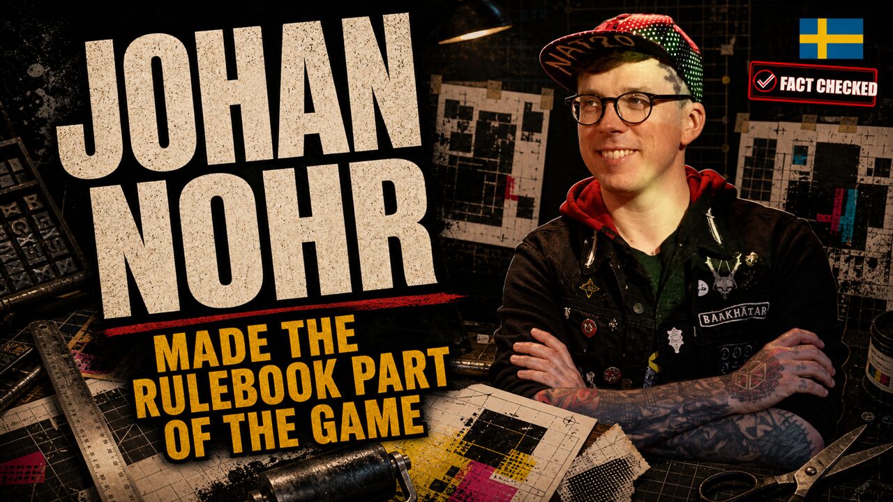
Blackletter crashes into acid yellow. Rules sit inside collages, diagrams, stains, and hard blocks of color. Some pages shout. Others leave a single piece of information exposed like evidence. The book does not politely describe a dying world. It behaves as though the world has already damaged the object in your hands.
Johan Nohr created that visual system. Pelle Nilsson wrote the core text and designed the rules. Together they co-created MÖRK BORG, and the distinction between their jobs is the reason the collaboration can be understood.
Nohr did not decorate a finished game.
He made reading part of entering it.
The Trained Eye
Johan Nohr is a Swedish visual artist, illustrator, art director, and graphic designer associated with Stockholm’s tabletop scene. He has described himself as traditionally trained in graphic design. That training matters because MÖRK BORG’s apparent disorder is not the absence of control.
It is controlled disobedience.
Graphic design usually helps a reader move through information with minimal resistance. Hierarchy, spacing, grids, type choices, and repetition tell the eye where to go. Nohr knew those rules well enough to break them deliberately. A page could feel unstable while still delivering the rule the table needed.
Before MÖRK BORG, his work included graphic design and typography connected to Symbaroum and visual work on other Swedish projects. Exact product credits must remain exact. A freelance relationship with a publisher does not make every book from that publisher his work.
The useful pattern is narrower. Nohr learned how roleplaying books organize worlds, then began asking how the organization itself could carry tone.
The Book That Looked Doomed
MÖRK BORG first reached Swedish players and backers in 2019, followed by its broad English release and major recognition in 2020. Free League published and distributed it through Free League Workshop. The creators were Pelle Nilsson and Johan Nohr.
Nilsson supplied the rules, ideas, and setting text. Nohr handled art, illustration, typography, layout, and graphic design. Patrick Stuart contributed to the English text and creative adaptation.
The book’s visual identity is immediate: cadmium yellow, deep black, flashes of pink, blackletter, collage, woodcut-like monsters, bent columns, and spreads that treat each opening as a composition. The pages feel dangerous, but they are not random.
A conventional rulebook often separates function from atmosphere. Rules occupy clean columns. Art creates mood around them. Nohr collapsed that division. A rule’s size, angle, color, and position tell the reader how much force it carries. A table of awful results can become a visual event. A monster can interrupt the page rather than wait inside a polite frame.
The design also changes the pace of reading. Some information is found instantly because it is huge. Other information requires the reader to slow down and inspect. That friction would be a failure in a neutral technical manual. In MÖRK BORG, it helps establish a world that is hostile, damaged, and unstable.
The key is that the rules underneath are compact. Nilsson’s terse system gives Nohr room to make each spread distinct without burying a large simulation. The writing and graphics create pressure in different ways, then meet in the same object.
When Layout Becomes Play
Calling this "graphic design as game design" does not mean Nohr secretly wrote every rule.
It means the artifact affects the player’s approach to the rules.
Before play, the book establishes permission. It tells the referee that ugliness, speed, cruelty, humor, and improvisation belong here. It tells players not to expect polished heroic safety. During play, the visual hierarchy helps certain procedures land with force. After play, the book remains a generator of tone, props, monsters, and possible scenes.
The page becomes part of the social contract.
Nohr’s achievement is not that expressive layout had never existed before. Roleplaying books had used illustration, experimental typography, marginalia, and unusual formats for decades. The stronger claim is documented and specific. MÖRK BORG brought an unusually aggressive, coherent visual system into a compact commercial RPG and made that system inseparable from how the game was discussed, imitated, and expanded.
The 2020 ENnie results show the combination clearly. MÖRK BORG received Gold for Product of the Year, Best Writing, and Best Layout and Design. It received Silver for Best Game. It did not receive Gold for Best Game.
Nilsson and Nohr were both named in the award record, but the individual work should remain visible. Nohr’s clearest award-linked contribution is the layout and design that made the book itself part of the argument.
The City After The Castle
CY_BORG tested the method in another world.
Christian Sahlén wrote the rules and text. Johan Nohr created the art and graphic design. The two are credited as co-creators. Nilsson’s MÖRK BORG rules form part of the underlying lineage, but he should not be credited as the writer of CY_BORG.
The new book did not merely repaint the old one with neon.
A cyberpunk city needs different visual pressure. Corporate grime, broken interfaces, surveillance, corrupted screens, dense signage, and technological waste replace the medieval apocalypse. Nohr adjusted the visual language while preserving the idea that every spread should communicate the setting before it is fully read.
The distinction matters because style is not a bag of effects. If the same font, color, and collage had been placed over every project, the method would collapse into branding. CY_BORG shows Nohr treating visual design as adaptation. The page must behave like this world, not the previous one.
The Quiet Book
Into the Odd Remastered proves the point from the other direction.
Chris McDowall wrote and designed Into the Odd. Nohr created art and graphic design for the remastered edition. The original rules do not become Nohr’s because he shaped their new physical presentation.
The visual work is more restrained than MÖRK BORG. The book still has a strong identity, but the hierarchy, palette, and pacing answer a different text. Nohr did not need to make every page scream to prove authorship.
That restraint is important evidence. It shows a designer of visual systems rather than one successful look.
Nohr has also worked on projects including Barkhäxan, Oktoberlandet, Symbaroum, and other titles, with roles varying between illustration, typography, layout, and graphic design. Those credits must be checked in each book. Recent and announced work should not be promoted from a biography or campaign page into a finished-product claim without a final colophon.
The Licensed Mess
Nilsson and Nohr also gave MÖRK BORG a permissive third-party license. It allowed independent creators to publish compatible work under clear attribution terms without surrendering a cut to the original creators.
The ecosystem became large. Exact totals change and should always be dated. More important is the kind of participation the license encouraged. Creators could write an adventure, build a generator, make a zine, alter the rules, or construct another game from the chassis.
Many borrowed the visual language too.
That influence creates an attribution trap. A blackletter title and yellow field do not make a product Nohr’s art. A compatible logo does not make him its designer. Death in Space has its own creators. Pirate Borg has its own team. Thousands of third-party pages belong to the artists and writers who made them.
Nohr’s influence is visible in the permission and the example, not in ownership of every response.
What Nohr Actually Built
Johan Nohr did not write the core MÖRK BORG rules. Pelle Nilsson did. Nohr did not write CY_BORG; Christian Sahlén did. He did not design Into the Odd; Chris McDowall did. Expressive layout existed before his work, and the third-party ecosystem does not transfer its creators’ credits to him.
What Nohr built was a visual architecture that changed what readers expected a small roleplaying game to be.
The cover announces danger before the text explains it.
The spread controls attention through color, scale, and collision.
The illustration does not wait beside the rule. It argues with it.
The book becomes a performance of the setting.
This is why the work reached beyond one aesthetic. MÖRK BORG made destruction legible. CY_BORG made the page feel technologically contaminated. Into the Odd Remastered showed that the same eye could become quieter when the game required it.
Nohr’s contribution sits between art and use. He makes a page carry information, attitude, permission, and memory at the same time.
The rulebook does not disappear once the game begins. It has already taught the table how to see.
Where To Find His Work
Johan Nohr maintains an official portfolio at https://nohr.se/ and an independent game page at https://jnohr.itch.io/. His public Bluesky profile is https://bsky.app/profile/nohr.se.
Free League maintains official pages for MÖRK BORG, CY_BORG, and Into the Odd Remastered. Nohr’s art book and Stockholm Kartell work are represented through the collective’s stores and publisher pages. Product credits remain the authority for separating illustration, graphic design, writing, development, and original game design.
The best way to understand Nohr’s work is still physical. Open the book. Notice where the eye lands, where it hesitates, and what the page makes you expect from the people at the table.
The game has started before the dice arrive.
Fact Check Notes
Publication notes
This site is AI-assisted and human-reviewed. We use artificial intelligence to help gather research, organize source material, and draft profile content. Human editors then read, revise, and check each profile before it goes live. Most profiles are built through deep AI research and two separate rounds of fact-checking.