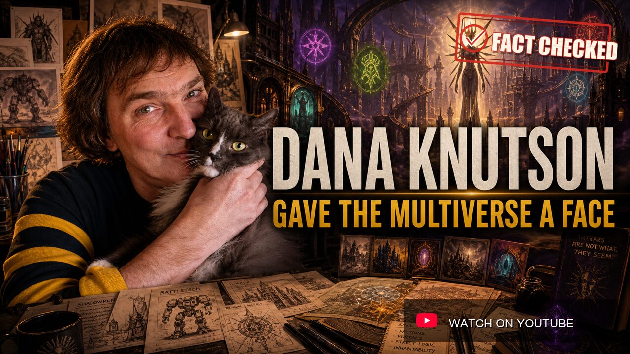
Dana Knutson drew a woman with blades around her face, and Dungeons & Dragons changed shape.
That is the cleanest way into his story.
The Lady of Pain did not need a stat block. She did not need a long speech. She did not need to explain herself. Her expressionless face, floating presence, and halo of knives told players everything they needed to know about Sigil before a Dungeon Master opened a rulebook.
This was not standard fantasy illustration.
It was visual law.
In a tabletop game, that matters more than people admit. A single image can teach a table what the world allows, what it forbids, and what it will punish.
The Lady of Pain said that Planescape was not another kingdom of castles and dragons. It was dangerous, philosophical, alien, urban, and older than the assumptions players brought to the table. She became the setting’s mark because she did what the best game art does: she taught the rules of the world without turning them into rules text.
Knutson’s career is full of that kind of work. BattleMechs that look like machines built for war, not heroes in metal suits. Shadowrun vehicles and critters that make magic feel dirty enough to survive in cyberpunk streets. Planescape buildings that look like a city where belief, bureaucracy, angels, fiends, and bad weather all have to pay rent. Magic cards that compress strange machines and body horror into a few square inches.
He was not only an illustrator.
He was a builder of visual systems.
The Fasa Years
Knutson became visible in tabletop publishing through FASA, one of the great laboratories of 1980s and early 1990s tabletop publishing. FASA needed more than pretty pictures. Its strongest lines depended on diagrams, equipment, ships, vehicles, factions, uniforms, maps, and hardware that players could believe in long enough to use.
That suited Knutson.
His work on Star Trek products put him inside a universe where technical credibility mattered. Ship recognition manuals, deck plans, combat simulators, and sourcebooks are not just art assignments. They are interface problems. The reader needs to see the difference between a Federation vessel and a Klingon warship. The player needs a deck plan that feels like a starship and still functions as a place where scenes can happen.
Renegade Legion pushed that design sense into graphic presentation and component play. FASA’s science-fiction games often treated diagrams, counters, templates, and unit views as part of the experience, not decoration after the design was done. Knutson’s art direction lived close to the table. The image had to be exciting, but it also had to help the game move.
BattleTech made the lesson permanent.
The global image of giant robots in the 1980s leaned heavily toward Japanese animation. Early BattleTech borrowed from that visual vocabulary before legal and publishing reality forced FASA toward more original designs. Knutson’s BattleMech work helped define the Western alternative: heavier, squatter, more industrial, and more military.
His machines often look less like knights and more like walking tanks.
That distinction matters. The cockpit disappears into the chassis. The head becomes small, protected, or almost irrelevant. The body is not there to pose. It is there to carry weapons, armor, heat, mass, and bad decisions into combat. A Knutson-style machine suggests tonnage before it suggests elegance.
That is why those designs worked. They helped BattleTech feel like a war game with fiction, not a cartoon with statistics.
Shadowrun And The Dirty Fantastic
Shadowrun asked for an even stranger visual trick.
It had to make elves, trolls, spirits, shamans, drones, cyberware, corporate armor, street weapons, and urban magic feel like they belonged in the same rain-soaked future. That combination is easy to describe now because Shadowrun made it familiar. At the time, it was a risky fusion.
Knutson’s FASA work helped ground the impossible.
The cyberpunk pieces needed grit. The magical creatures needed biology. Vehicles and drones needed practical weight. A supernatural threat could not float in from a clean fantasy painting. It had to feel like something that might crawl through an alley, break into a lab, or get tagged in a corporate field report.
That is the bridge between Shadowrun and Planescape.
Knutson was good at making the unreal feel engineered. He could draw a machine that looked like it had maintenance problems. He could draw a monster that looked as if someone had classified it. He could draw a city that looked impossible, then give it enough visual logic that players accepted the impossibility.
The City Of Doors
Planescape was the work that gave Knutson’s gift its widest stage.
David "Zeb" Cook had the design problem. Advanced Dungeons & Dragons already had a cosmology full of planes, gods, fiends, elements, alignments, and metaphysical arguments. The problem was not that the material was small. The problem was that it had no single human door.
Planescape needed a look.
Knutson gave it one.
Sigil became a city of spikes, blades, cramped streets, looming structures, and visual unease. It was not medieval Europe. It was not clean heaven or red hell. It was a place where every alley felt like a philosophical argument with plumbing. The buildings seemed to lean, hook, scrape, and threaten. The city did not merely contain danger. It wore danger in its walls.
Tony DiTerlizzi’s interior illustrations and Robh Ruppel’s covers became the most widely remembered finished art of the line, and rightly so. But Knutson’s concept work supplied the bones. Cook has described how he talked and Knutson drew, turning abstract needs into buildings, people, streets, symbols, and finally the Lady of Pain.
That collaborative chain is important. Planescape was not one artist alone. It was Cook’s design, Knutson’s concepts, DiTerlizzi’s interiors, Ruppel’s covers, Dawn Murin and Dee Barnett’s graphic design, and a full production team turning the pieces into a line.
But the visual premise starts with Knutson.
The Lady of Pain is the most famous image because she condenses the whole setting into one silent figure. She is beautiful only if beauty has become a legal threat. She has no readable emotion. The blades do not look decorative. They look like jurisdiction.
That is extraordinary game art. It does not illustrate a paragraph. It creates a rule of the world.
Magic At Card Size
In the late 1990s and early 2000s, Knutson did work for Magic: The Gathering as both an illustrator and an art director.
Card art is a different discipline from RPG sourcebook art. It is smaller, faster, and less forgiving. The image has to survive reduction, a frame, rules text, color identity, and the pressure of being shuffled beside hundreds of other images. A great card image must be readable at a glance and still reward the player who stares at it during a long game.
Knutson’s Magic illustrations show the range that had defined his earlier career. Ornithopter let him return to functional machine design. Phyrexian Delver pushed into dark biomechanical horror. Howling Mine gave a classic artifact a strange, memorable form. Other cards, including Forsaken City and Rib Cage Spider, show an artist comfortable with both structure and unease.
His larger job was art direction.
Public Magic reference sources often place his art-director tenure from Mercadian Masques through Legions, a period when Magic relied on block identity and setting continuity. That meant more than assigning cool paintings. An art director had to help the game feel visually coherent across expansions, creature types, worlds, factions, artifacts, and story beats.
That was exactly the kind of problem Knutson had spent years solving.
FASA taught him how vehicles, uniforms, logos, and diagrams make a universe believable. Planescape taught the industry how a setting could be sold through a total visual mood. Magic required that same discipline at card scale, multiplied across hundreds of images and many artists.
The Digital Turn
Knutson’s later career also moved into digital games.
Public credit trails often list him on Microsoft’s cancelled Mythica project and later in concept and effects work connected to Big Fish Games titles such as Hidden Expedition and Mystery Case Files. The shift matters because it shows a commercial artist adapting across media. Tabletop illustration, card art, concept design, interface art, effects work, and digital production each ask different things from the hand and the eye.
Knutson began in a world of ink, paint, boards, and physical layouts. Later work required digital tools, 3D thinking, and assets meant for screens rather than books. The through-line is not medium. It is world logic.
Whether the final object was a BattleTech technical readout, a Planescape boxed set, a Magic card, or a hidden-object scene, Knutson’s strongest work asked the same question: what does this world look like when it stops being an idea and starts being a place?
What He Actually Built
Knutson did not write the BattleTech rules. He did not create Shadowrun’s core mechanics. He did not design Planescape’s cosmology. He did not invent Magic: The Gathering.
What he built was the visual grammar that made those systems feel inhabitable.
Players do not fall in love with a setting because it is large. They fall in love because it feels real enough to push against. Knutson made worlds that pushed back.
That is not a lesser craft. It is simply a different one.
Tabletop games live in imagination, but imagination needs handles. A player has to know what a BattleMech feels like before it moves. A Game Master has to understand Sigil before describing a street. A Magic player has to recognize an artifact’s tone before reading every line of rules text. Art provides those handles.
Knutson’s best work does more than decorate. It teaches.
His BattleMechs teach mass and function. His Shadowrun work teaches that magic and machinery can share the same dirty city. His Planescape concepts teach that philosophy can have a skyline. The Lady of Pain teaches that the most powerful person in the room may not need to speak.
That is why his legacy is hard to separate from the games themselves. Remove the art, and the rules still exist. Remove the art, and the worlds become harder to enter.
Where To Find Him
Dana Knutson’s public online trail is quieter than the scale of his influence. His work remains easiest to find through the games that carry it: BattleTech technical readouts, early Shadowrun books, Planescape boxed sets and supplements, Magic cards credited to him, and digital-game credit databases.
For a single doorway, look at Planescape.
Look at the Lady of Pain.
Then look at Sigil around her: the blades, the angles, the cramped danger, the feeling that the city itself has rules you have not learned yet.
That is the thing Knutson gave gaming at his best.
Not one painting.
A way for worlds to look back.
Fact Check Notes
Publication notes
This site is AI-assisted and human-reviewed. We use artificial intelligence to help gather research, organize source material, and draft profile content. Human editors then read, revise, and check each profile before it goes live. Most profiles are built through deep AI research and two separate rounds of fact-checking.
Leave a Reply
You must be logged in to post a comment.